Note
Access to this page requires authorization. You can try signing in or changing directories.
Access to this page requires authorization. You can try changing directories.
The brand identity of Microsoft .NET is about to get a fresh makeover! .NET has become an incredible success in the past 7+ years with more than 4 million developers around the world using it to build great software and rich, compelling Web experiences. The upcoming .NET Framework 4 release will likely increase adoption momentum and the new logo adds a contemporary face to .NET's image in the industry.
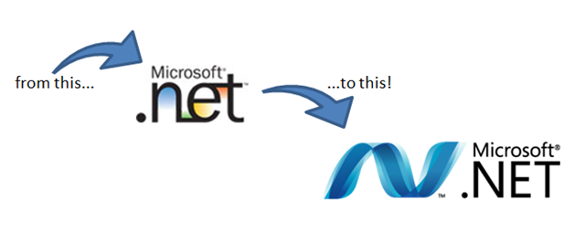
I like it. What do you think of it?
Comments
- Anonymous
October 24, 2008
PingBack from http://www.hecgo.com/2008/10/24/nuevo-logo-de-net/ - Anonymous
October 25, 2008
A .net több, mint 7 éves logója megváltozik, szebb, modernebb, hullámosabb lesz, és a Microsoft szerint - Anonymous
October 28, 2008
It's definitely better, and something I will actually consider branding my product with (the old logo was simply out of the question). But I wish it were a little more compact and concise. The N seems way too wide and unwieldy and would be hard to place. The old version was much more compact.