Note
Access to this page requires authorization. You can try signing in or changing directories.
Access to this page requires authorization. You can try changing directories.
APPLIES TO: ![]() Power BI Desktop
Power BI Desktop ![]() Power BI service
Power BI service
Power BI provides many different ways to customize the formatting and colors used in your report visuals. This article provides some tips to make your Power BI visualizations more compelling, interesting, and customized to your needs.
To make any changes, you must be editing your report.
Open a report in Report view.

When the Filters and Visualizations panes appear along the right side of the report canvas, you're ready to start customizing. If the panes don't appear, select the arrows to open them.

Apply a theme
In Power BI Desktop, you can apply design changes to your entire report. With themes, you can use corporate colors, change icon sets, or apply new default visual formatting. When you apply a report theme, all visuals in your report use the colors and formatting from your selected theme. To learn more, see Use report themes in Power BI Desktop.
A tenant admin can include organizational themes in the list for all users in addition to the themes provided. To learn more, see Use organizational themes.

Here, we applied the Innovate theme to the report.

Report themes are also available in the Power BI service.

You can undo a theme change with CTRL Z or using the undo buttons.
Change the color of a single data point
Sometimes you want to highlight one particular data point. Perhaps it's a sales figure for the launch of a new product, or improvements in quality scores after launching a new program. With Power BI, you can highlight a particular data point by changing its color.
The following visualization shows sales by segment.

Imagine you want to call out the Small Business segment to show how well this new segment is performing by using color. Here are the steps:
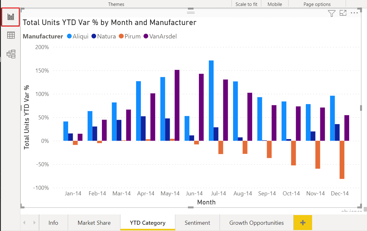
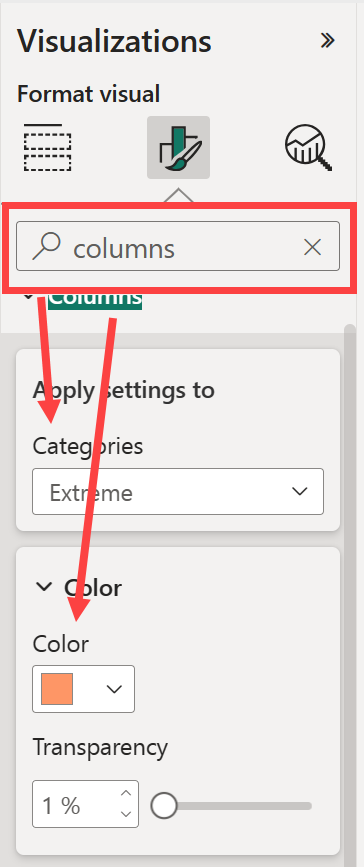
For each visual type, there are many color options. You can color text, gridlines, backgrounds, and more. The path to the Color option that you want might not be the same across visuals. For that reason, select the visual and then use the Search bar to find the chart feature that you want to color. For a column chart, search for Column. The color option we want is on the Columns card.
From the Categories dropdown, select All to set the same color for all columns. To change the color of the Small Business column, select Small Business from the Categories dropdown and the new color from the Color card.
Once selected, the Small Business data point is a nice shade of orange, and certainly stands out.
If you expect to add new columns to the chart and want to maintain the same color scheme, be sure to set the Default color to blue.
If you change the bar chart to a different visual, such as a column chart, the visual keeps Small Business colored orange.
Add conditional formatting for visuals color
Visualizations often benefit from dynamically setting color based on a numeric value in the visual.
The following sections demonstrate different ways to base color on a numeric value.
Base the color of data points on a value
First, select the visual you want to adjust. Open the Format your visual pane by selecting the paint brush icon and then search for the Colors card. Since our example uses a column chart, scroll down to Columns. Next to Color, select the fx icon.
Note
Not all visuals will have the option to conditionally format the color, such as the color on a line visual.

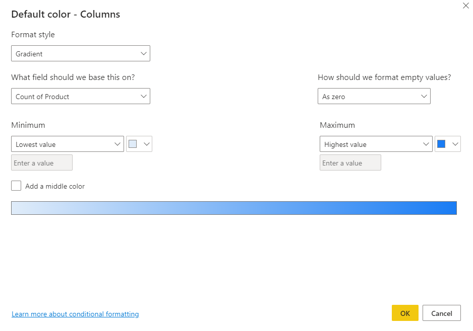
Format style gives you three ways to set the conditional formatting of this color.
- Rules lets you specify the color based on the value as a list of rules.
- Gradient lets you specify the color based on a minimum or maximum value with option to have a middle color.
- Field value lets you choose a measure or data column in your data model with the color, as a text data type.
In this example, we apply a gradient format style and select the Sum of Sales for the field we should base this on. Then we choose light blue for the Lowest value and dark blue for Highest value.
This setting applies the conditional formatting to the bar colors. Selecting the fx button opens the dialog to adjust the conditional formatting, and selecting the Eraser button clears the conditional formatting. The previously selected color for Small Business is removed.

You can also format the color of the visual using a measure or column that isn't part of the visual. In the following image, we use Sum of Profit.

Undo in Power BI
Like many other Microsoft services and software, Power BI provides an easy way to undo your last change. For example, let's say you change the color of a data point, or a series of data points, and you don't like the color when it appears in the visualization. You don't recall exactly which color it was before, but you know you want that color back.
To undo your last action, or the last few actions, all you have to do is type CTRL + Z as many times as needed.
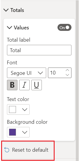
To discard all the customizations you did to a part of the visual formatting, select Reset to default underneath that setting.
In the Format pane settings or ellipsis (...) at the top, you can Reset all settings to default for a specific visual.
Give us your feedback
Do you have a tip you want to share? Send it our way.