Exercise - Use Grid to build a user interface
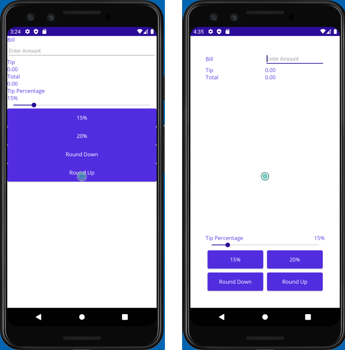
In this exercise, you use a Grid to arrange the views in your User Interface (UI). You start with another version of the TipCalculator project, and adjust it to make the UI more intuitive. You also move the buttons to the bottom of the page. This time you use a Grid layout rather than using VerticalStackLayout and HorizontalStackLayout. The following image shows the initial UI, and the UI that results from following the steps in this exercise:
Open the starter solution
The starter solution contains a fully functional tip calculator app.
Using Visual Studio, open the starter solution in the exercise3/TipCalculator folder in the repo that you cloned at the start of the previous exercise.
Open MainPage.xaml. Notice that all the views are displayed using one
VerticalStackLayoutpanel:<?xml version="1.0" encoding="utf-8" ?> <ContentPage xmlns="http://schemas.microsoft.com/dotnet/2021/maui" xmlns:x="http://schemas.microsoft.com/winfx/2009/xaml" xmlns:local="clr-namespace:TipCalculator" x:Class="TipCalculator.MainPage"> <VerticalStackLayout> <Label Text="Bill" /> <Entry x:Name="billInput" Placeholder="Enter Amount" Keyboard="Numeric" /> <Label Text="Tip" /> <Label x:Name="tipOutput" Text="0.00" /> <Label Text="Total" /> <Label x:Name="totalOutput" Text="0.00" /> <Label Text="Tip Percentage" /> <Label x:Name="tipPercent" Text="15%" /> <Slider x:Name="tipPercentSlider" Minimum="0" Maximum="100" Value="15" /> <Button Text="15%" Clicked="OnNormalTip" /> <Button Text="20%" Clicked="OnGenerousTip" /> <Button x:Name="roundDown" Text="Round Down" /> <Button x:Name="roundUp" Text="Round Up" /> </VerticalStackLayout> </ContentPage>
Create a Grid layout
Change the layout panel from
VerticalStackLayouttoGridwith padding of40units.Define seven rows and two columns for the
Grid. Make all the rowsAutosize except the fourth row. The fourth row should useStarso it gets all the remaining space available in the grid. UseStarsizing for both columns.<Grid RowDefinitions="Auto, Auto, Auto, *, Auto, Auto, Auto" ColumnDefinitions="*, *" Padding="40"> ... </Grid>
Position the views in the cells
Add settings for
Grid.RowandGrid.Columnto each of the views to assign them to the appropriate cell in theGrid. Use the following screenshot to help you determine where each view should be placed:
The following example shows how to set the position for the Bill
Label, and thebillInputEntryview:... <Label Text="Bill" Grid.Row="0" Grid.Column="0"/> <Entry x:Name="billInput" Placeholder="Enter Amount" Keyboard="Numeric" Grid.Row="0" Grid.Column="1"/> ...Align the Bill
LabelandEntryby setting theVerticalOptionsproperty toCenteron the Label.Add a setting for
Grid.ColumnSpanto theSliderso it spans two columns:<Slider ... Grid.ColumnSpan="2" ... />Locate the
Labelwith the text Tip Percentage. Set it so that it occupies the lower-left position in its rectangle:<Label Text="Tip Percentage" VerticalOptions="End" HorizontalOptions="Start" ... />Locate the
Labelnamed tipPercent. Set it so that it occupies the lower-right position in its rectangle:<Label x:Name="tipPercent" VerticalOptions="End" HorizontalOptions="End" ... />Set the
Marginproperty for all four buttons to5.
The complete Extensible Application Markup Language (XAML) markup for the page should look like this:
<ContentPage xmlns="http://schemas.microsoft.com/dotnet/2021/maui"
             xmlns:x="http://schemas.microsoft.com/winfx/2009/xaml"
             xmlns:local="clr-namespace:TipCalculator"
             x:Class="TipCalculator.MainPage">
    <Grid RowDefinitions="Auto, Auto, Auto, *, Auto, Auto, Auto"
          ColumnDefinitions="*, *"
          Padding="40">

        <Label Text="Bill" VerticalOptions="Center" Grid.Row="0" Grid.Column="0"/>
        <Entry x:Name="billInput" Placeholder="Enter Amount" Keyboard="Numeric" Grid.Row="0" Grid.Column="1"/>

        <Label Text="Tip" Grid.Row="1" Grid.Column="0"/>
        <Label x:Name="tipOutput" Text="0.00" Grid.Row="1" Grid.Column="1"/>

        <Label Text="Total" Grid.Row="2" Grid.Column="0"/>
        <Label x:Name="totalOutput" Text="0.00" Grid.Row="2" Grid.Column="1"/>

        <Label Text="Tip Percentage" VerticalOptions="End" HorizontalOptions="Start" Grid.Row="3" Grid.Column="0"/>
        <Label x:Name="tipPercent" Text="15%" VerticalOptions="End" HorizontalOptions="End" Grid.Row="3" Grid.Column="1"/>
        <Slider x:Name="tipPercentSlider" Minimum="0" Maximum="100" Value="15" Grid.Row="4" Grid.Column="0" Grid.ColumnSpan="2"/>

        <Button Text="15%" Clicked="OnNormalTip" Margin="5" Grid.Row="5" Grid.Column="0"/>
        <Button Text="20%" Clicked="OnGenerousTip" Margin="5" Grid.Row="5" Grid.Column="1"/>

        <Button x:Name="roundDown" Margin="5" Text="Round Down" Grid.Row="6" Grid.Column="0"/>
        <Button x:Name="roundUp"   Margin="5" Text="Round Up" Grid.Row="6" Grid.Column="1"/>

    </Grid>
</ContentPage>
Examine the results
Run the application and look at the differences in the UI. You used a Grid to improve the aesthetics of an existing UI. Grid is more powerful than StackLayout. In particular, Grid makes it far easier to align views across rows.