Build for phones or tablets
When building a Microsoft Power Apps canvas app, you can choose between two primary form factors: Phone or Tablet. Use the Tablet form factor if most users access the app from a desktop or laptop computer, as it aligns with standard screen dimensions. Use the Phone form factor if the app is primarily intended for smartphones.
The Phone form factor allows you to tailor controls and layout specifically for smaller screens. If you build on the Tablet form factor and open the app on a smartphone, users may not see the entire canvas or may need to rotate their device, which can result in unreadable small fonts.
It's possible to design a responsive app that adapts to both form factors, but that approach is outside the scope of this lesson.
You've already worked with the Tablet form factor. Now, take a moment to create a new app using the Phone form factor. You’ll immediately notice the change in available canvas space.
Adjust app display settings
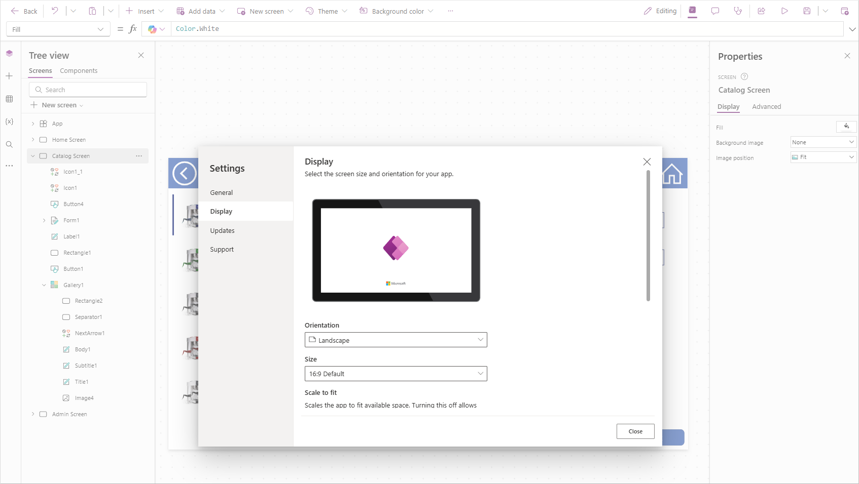
You can adjust canvas size and orientation through the app Settings panel.
While editing your app, select the Settings button from the command bar. The Settings panel opens to the General tab, where you can update the app name, icon, and description.
To modify the app’s display properties, select the Display tab. From here, you can change the Orientation to either Landscape (default) or Portrait.
The default Size is set to 16:9, but other aspect ratios are available, including a Custom option. Changing the display settings prompts you to apply the changes.
Warning
If you resize your app after building it, you may need to rearrange controls to fit the new form factor.
You can also toggle settings to Lock aspect ratio (enabled by default) and Lock orientation. Each option includes a description of its behavior in Microsoft Power Apps.

Preview your app on different devices
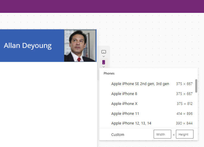
Microsoft Power Apps includes a built-in preview tool that shows how your app appears on different mobile platforms. To access it:
With your app in Preview mode, look for the icons representing a tablet, phone, and browser screen.
Select one of the device icons to open a scrollable list of supported devices. For example, selecting Phone displays popular smartphone models. A Custom option is also available if your device isn’t listed.

If your app is built on a Tablet form factor, you can also test different device Orientations:


This view helps you evaluate whether the Phone form factor with a horizontal orientation might be a better fit for your target users.