Note
Access to this page requires authorization. You can try signing in or changing directories.
Access to this page requires authorization. You can try changing directories.
The Toolbox window displays controls that you can add to Visual Studio projects. To open Toolbox, choose View > Toolbox from the menu bar, or press Ctrl+Alt+X.

You can drag and drop different controls onto the surface of the designer you are using, and resize and position the controls.
Toolbox appears in conjunction with designer views, such as the designer view of a XAML file or a Windows Forms App project. Toolbox displays only those controls that can be used in the current designer. You can search within Toolbox to further filter the items that appear.
Note
For some project types, Toolbox may not show any items.
The .NET version that your project targets also affects the set of controls visible in Toolbox. You can change the target framework version from the project's property pages, if necessary. Select the project node in Solution Explorer, and then on the menu bar, choose Project > projectname Properties. On the Application tab, use the Target framework drop-down.

Manage the Toolbox window and its controls
By default, Toolbox is collapsed along the left side of the Visual Studio IDE and appears when the cursor is moved over it. You can pin Toolbox (by clicking the Pin icon on its toolbar) so that it remains open when you move the cursor. You can also undock the Toolbox window and drag it anywhere on your screen. You can dock, undock, and hide Toolbox by right-clicking its toolbar and selecting one of the options.
Tip
If the Toolbox no longer appears as collapsed along the left side of the Visual Studio IDE, you can add it back by choosing Window > Reset Window Layout from the menu bar.
You can rearrange the items in a Toolbox tab or add custom tabs and items by using the following commands on the right-click context menu:
Rename Item - Renames the selected item.
List View - Shows the controls in a vertical list. If unchecked, the controls appear horizontally.
Show All - Shows all possible controls (not just the ones that apply to the current designer).
Choose Items - Opens the Choose Toolbox Items dialog box so that you can specify the items that appear in the Toolbox. You can show or hide an item by selecting or clearing its check box.
Sort Items Alphabetically - Sorts the items by name.
Reset Toolbar - Restores the default Toolbox settings and items.
Add Tab - Adds a new Toolbox tab.
Move Up - Moves the selected item up.
Move Down - Moves the selected item down.
Create and distribute custom Toolbox controls
You can create custom Toolbox controls, starting either with a project template that's based on Windows Presentation Foundation or on Windows Forms. You can then distribute your custom control to your teammates, or publish it on the web by using the Toolbox Controls Installer.
Toolbox, Components tab
Displays components you can add to Visual Basic and C# designers for Windows Forms. In addition to the .NET components that are included with Visual Studio, such as the MessageQueue and EventLog components, you can add your own or third-party components to this tab.
To display this tab, open a Windows Forms designer. Select View > Toolbox. In Toolbox, select the Components tab.
Components
BackgroundWorker
Creates a BackgroundWorker component instance that can run an operation on a separate, dedicated thread. For more information, see BackgroundWorker component.
DirectoryEntry
Creates a DirectoryEntry component instance that encapsulates a node or object in the Active Directory hierarchy and can be used to interact with Active Directory service providers.
DirectorySearcher
Creates a DirectorySearcher component instance that you can use to perform queries against the Active Directory.
ErrorProvider
Creates a ErrorProvider component instance, which indicates to the end user that a control on a form has an error associated with it. For more information, see ErrorProvider component.
EventLog
Creates an EventLog component instance you can use to interact with system and custom event logs, including writing events to a log and reading log data.
FileSystemWatcher
Creates a FileSystemWatcher component instance that you can use to monitor for changes to any directory or file to which you have access.
HelpProvider
Creates a HelpProvider component instance that provides pop-up or online help for controls. For more information, see HelpProvider component.
ImageList
Creates a ImageList component instance that provides methods to manage a collection of Image objects. For more information, see ImageList component.
MessageQueue
Creates a MessageQueue component instance that you can use to interact with message queues, including reading messages from and writing messages to queues, processing transactions, and performing queue administration tasks.
PerformanceCounter
Creates a PerformanceCounter component instance that you can use to interact with Windows performance counters, including creating new categories and instances, reading values from counters, and performing calculations on counter data.
Process
Creates a Process component instance you can use to stop, start, and manipulate the data associated with processes on your system.
SerialPort
Creates a SerialPort component instance that provides synchronous and event-driven I/O, access to pin and break states, and access to serial driver properties.
ServiceController
Creates a ServiceController component instance you can use to manipulate existing services, including starting and stopping services and sending commands to them.
Timer
Creates a Timer component instance you can use to add time-based functionality to your Windows-based applications. For more information, see Timer component.
Note
There is also a system-based Timer that you can add to the Toolbox This Timer is optimized for server applications, and the Windows Forms Timer is best suited for use on Windows Forms.
Toolbox, HTML tab
The HTML tab of the Toolbox provides components that are useful on web pages and web forms. To view this tab, first open a document for editing in the HTML designer. On the View menu, click Toolbox, and then click the HTML tab of the Toolbox.
To create an instance of a tool on the HTML tab, either double-click the tool to add it to your document at the current insertion point, or select the tool and drag it to the desired position on the editing surface.
The following tools are available by default on the HTML tab.
Pointer

This tool is selected by default when any Toolbox tab opens. It cannot be deleted. The pointer enables you to drag objects onto the Design view surface, resize them, and reposition them on the page or form. For more information, see Toolbox.
Input (Button)

Inserts an input element of type="button". To change the text that is displayed, edit the name property. By default, id="Button1" is inserted for the first button, id="Button2" for the second, and so on.
When you drag Input (Button) onto the Design view surface, HTML markup like the following is inserted into your document:
<input id="Button1" type="button" value="Button" name="Button1">
Input (Reset)

Inserts an input element of type="reset". To change the text that is displayed, edit the name property. By default, id="Reset1" is inserted for the first reset button, id="Reset2" for the second, and so on.
When you drag Input (Reset) onto the Design view surface, HTML markup like the following is inserted into your document:
<input id="Reset1" type="reset" value="Reset" name="Reset1">
Input (Submit)

Inserts an input element of type="submit". To change the text that is displayed, edit the name property. By default, id="Submit1" is inserted for the first submit button, id="Submit2" for the second, and so on.
When you drag Input (Submit) onto the Design view surface, HTML markup like the following is inserted into your document:
<input id="Submit1" type="submit" value="Submit" name="Submit1">
Input (Text)
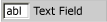
Inserts an input element of type="text" in your document. To change the default text that is displayed, edit the value attribute. By default, id="Text1" is inserted for the first text field, id="Text2" for the second, and so on.
When you drag Input (Text) onto the Design view surface, HTML markup like the following is inserted into your document:
<input id="Text1" TYPE="text" value="Text Field" name="Text1">
Important
It is recommended that you validate all user input. For more information, see Validating User Input in ASP.NET Web Pages (Razor) Sites.
Input (File)
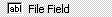
Inserts an input element of type="file" in your document. By default, id="File1" is inserted for the first file field, id="File2" for the second, and so on.
When you drag Input (File) onto the Design view surface, HTML markup like the following is inserted into your document:
<input id="File1" type="file" name="File1">
Important
It is recommended that you validate all user input. For more information, see Validating User Input in ASP.NET Web Pages (Razor) Sites.
Input (Password)
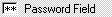
Inserts an input element of type="password". By default, id="Password1" is inserted for the first password field, id="Password2" for the second, and so on.
When you drag Input (Password) onto the Design view surface, HTML markup like the following is inserted into your document:
<input id="Password1" type="password" name="Password1">
Important
If your application transmits user names and passwords, you should configure your website to use Secure Sockets Layer (SSL) to encrypt the transmission. For more information, see Securing Connections. Additionally, it is recommended that you validate all user input. For more information, see Validating User Input in ASP.NET Web Pages (Razor) Sites.
Input (Check box)

Inserts an input element of type="checkbox". To change the text that is displayed, edit the name property. By default, id="Checkbox1" is inserted for the first check box, id="Checkbox2" for the second, and so on.
When you drag Input (Check box) onto the Design view surface, HTML markup like the following is inserted into your document:
<input id="Checkbox1" type="checkbox" name="Checkbox1">
Input (Radio)

Inserts an input element of type="radio". To change the text that is displayed, edit the name property. By default, id="Radio1" is inserted for the first radio button, id="Radio2" for the second, and so on.
When you drag Input (Radio) onto the Design view surface, HTML markup like the following is inserted into your document:
<input id="Radio1" type="radio" name="Radio1">
Input (Hidden)

Inserts an input element of type="hidden". By default, id="Hidden1" is inserted for the first hidden field, id="Hidden2" for the second, and so on.
When you drag Input (Hidden) onto the Design view surface, HTML markup like the following is inserted into your document:
<input id="Hidden1" type="hidden" name="Hidden1">
Textarea

Inserts a textarea element. You can resize the text area, or use its scroll bars to view text that extends beyond its display area. To change the default text that is displayed, edit the value attribute. By default, id="textarea1" is inserted the first text area, id=" textarea 2" for the second, and so on.
When you drag Textarea onto the Design view surface, HTML markup like the following is inserted into your document:
<textarea id=" textarea 1 name=" textarea 1" rows=2 cols=20></textarea>
Important
It is recommended that you validate all user input. For more information, see Validating User Input in ASP.NET Web Pages (Razor) Sites.
Table

Inserts a table element.
When you drag Table onto the Design view surface, HTML markup like the following is inserted into your document:
<table cellspacing="1" width="75%" border=1> <tr><td></td></tr></table>
Image
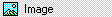
Inserts an img element. Edit this element to specify its src and its alt text.
When you drag Image onto the Design view surface, HTML markup like the following is inserted into your document:
<img alt="" src="">
Select

Inserts a dropdown select element (without a size attribute). By default, id="select1" is inserted for the first list box, id="select2" for the second, and so on.
When you drag Select onto the Design view surface, HTML markup like the following is inserted into your document:
<select id="select1" name="select1"><option selected></option></select>
You can create a multi-line select element by increasing the value of the size property.
Horizontal Rule
Inserts an hr element. To increase the thickness of the line, edit the size attribute.
When you drag Horizontal Rule onto the Design view surface, HTML markup like the following is inserted into your document:
<hr width="100%" size=1>
Div

Inserts a div element that includes an ms_positioning="FlowLayout" attribute. Except for the width and height, this item is identical to a Flow Layout Panel. To format the text that is contained within the div element, add a class="stylename" attribute to the opening tag.
When you drag Div onto the Design view surface, HTML markup like the following is inserted into your document:
<div ms_positioning="FlowLayout" style="width: 70px; position: relative; height: 15px">Label</div>
Toolbox, Data tab
Displays data objects you can add to forms and components. The Data tab of the Toolbox appears when you create a project that has an associated designer. The Toolbox appears by default in the Visual Studio integrated development environment; if you need to display the Toolbox, select Toolbox from the View menu.
Tip
Running the Data Source Configuration Wizard automatically creates and configures most data items. For more information, see Add new data sources.
To go directly to the .NET reference page for a component, press F1 on the item in the Toolbox or on the component item in the tray of the designer.
| Name | Description |
|---|---|
| DataSet | Adds an instance of a typed or untyped dataset to the form or component. When you drag this object onto a designer, it displays a dialog box that allows you to select an existing typed dataset class or specify that you want to create a new, blank, untyped dataset. Note: You do not use the DataSet object on the Toolbox to create a new typed dataset schema and class. For more information, see Create and configure datasets. |
| DataGridView | Provides a powerful and flexible way to display data in a tabular format. |
| BindingSource | Simplifies the process of binding controls to an underlying data source. |
| BindingNavigator | Represents the navigation and manipulation user interface (UI) for controls on a form that are bound to data. |